Interwoven
Branding and web design for an inclusive church in Altadena
Brief
In 2021, I was contacted by the founding pastors of Interwoven, a new PC(USA) worshipping community starting up in Altadena, California. I had been involved with Interwoven before, having edited their church proposal the year prior, so I knew this would be a project that was close to my heart. Interwoven’s mission was to “establish a safe and authentic faith community that uplifts the whole person,” using spiritual formation, mental health resources, education, and social enterprise to support community members as they became disciples.
The founding pastor, Harlan, was from the local community, and was passionate about founding a church that served Altadena. He and his team were looking for a brand identity and new website that matched their vision.
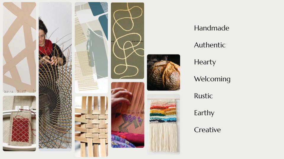
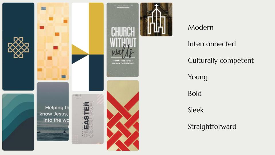
Discerning brand direction
I first met with Harlan and his co-pastor that summer to get a sense of what they were looking for. Because I was already familiar with the vision behind Interwoven, I prepared a few slides to present two possible directions for the feeling of the brand. One was handmade and authentic, drawing on language of weaving. The other was sleek and modern, using bold patterns and colors to communicate a similarly bold vision.
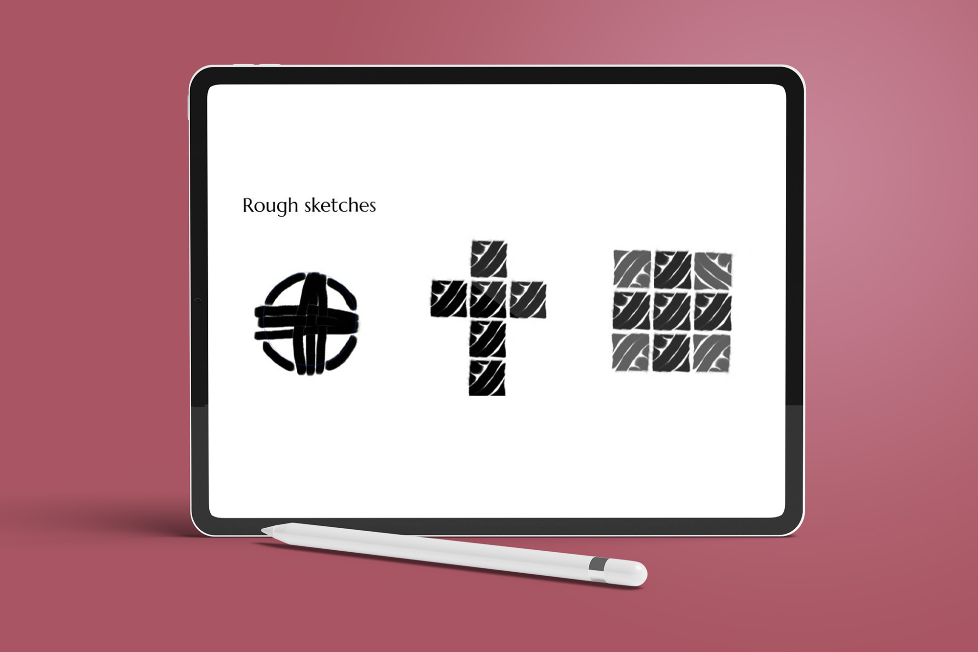
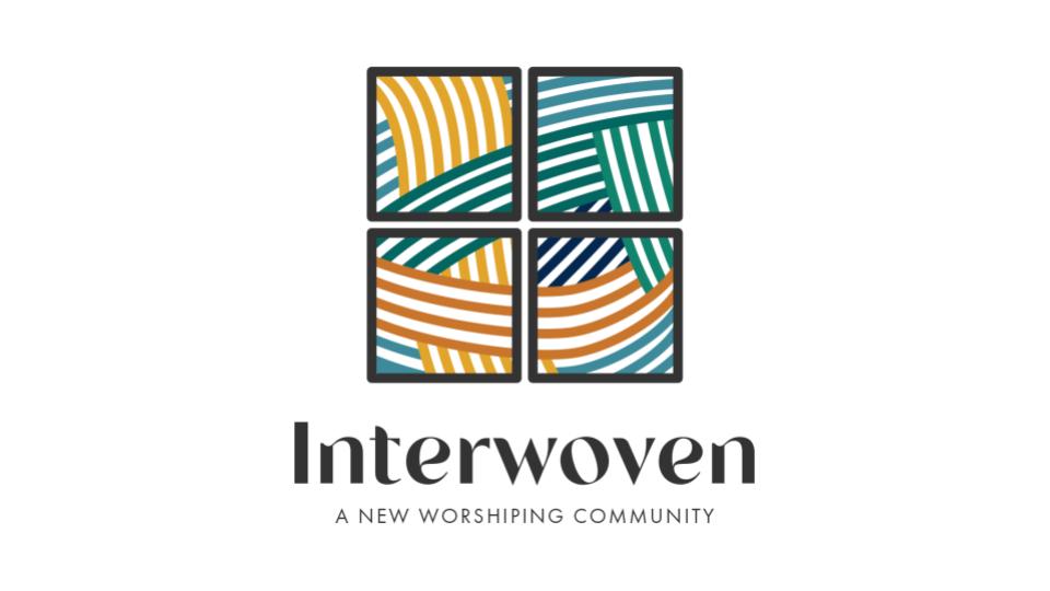
Working on the logo
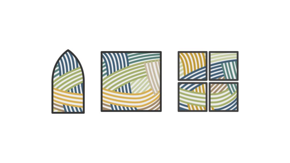
The pastoral team connected with the handmade feel for brand direction, and was especially excited about using visual language of weaving and handcrafts to represent the church. The next step was creating some rough sketches to come up with a general direction for a logo. We played with the idea of a yarn ball and a cross made of woven squares.
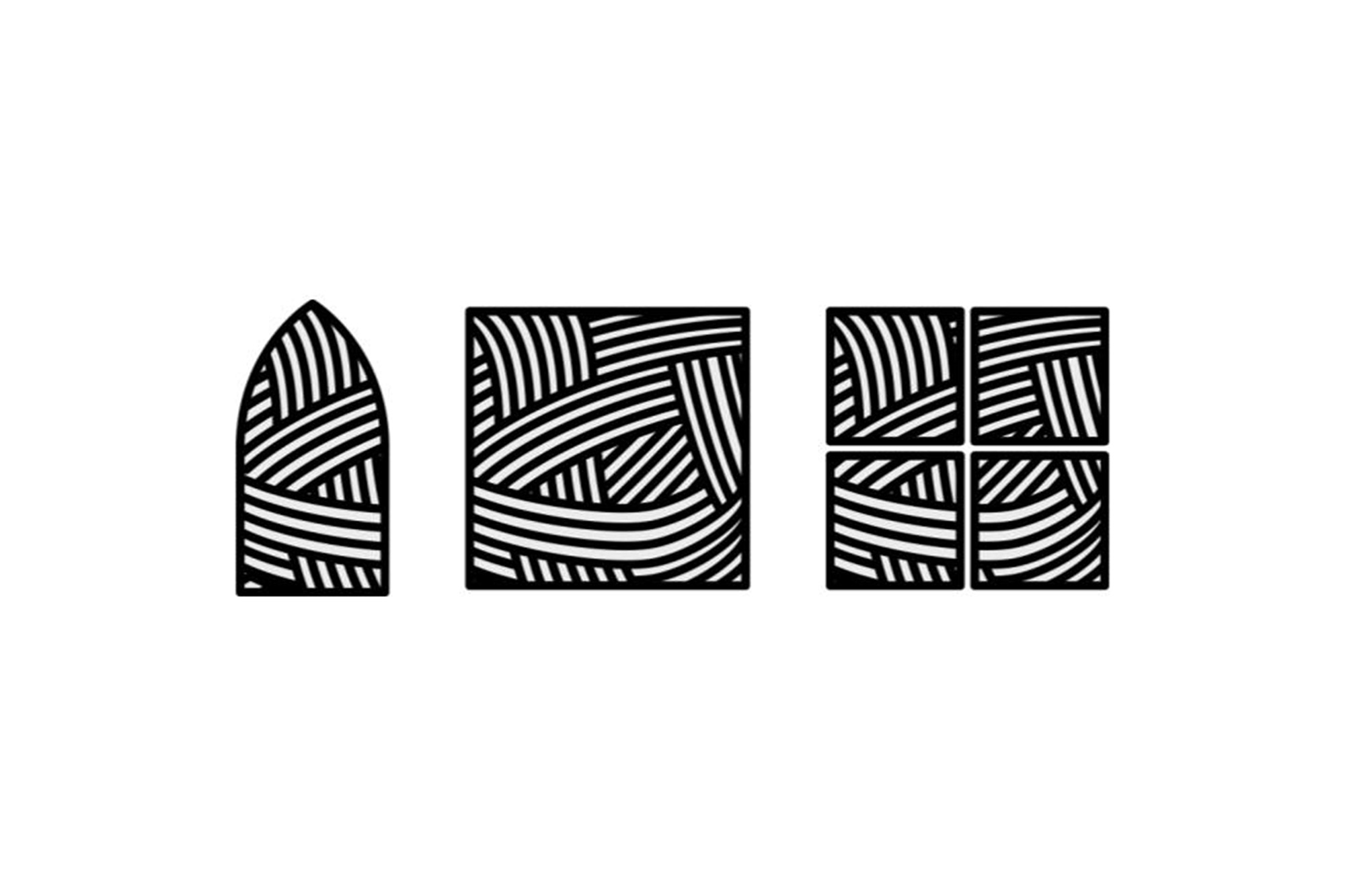
The client especially liked the grid, but wanted to step away from explicit cross imagery. They posed the idea of presenting a grid as something closer to a window. The following week, I presented three alternative windows made of woven textures.
Colors
Harlan had also shared that he wanted a blue and gold color scheme for the logo. Knowing that he and the team were concerned with honoring the identity of the local community, I took some time to chat with him and others on staff to get a sense for what made Altadena special. They talked of the surrounding nature and local landmarks, and I drafted an initial color scheme that used blue and gold as a base, but pulled in other colors that drew from nature.
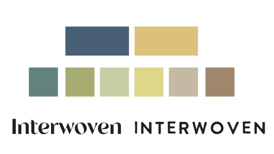
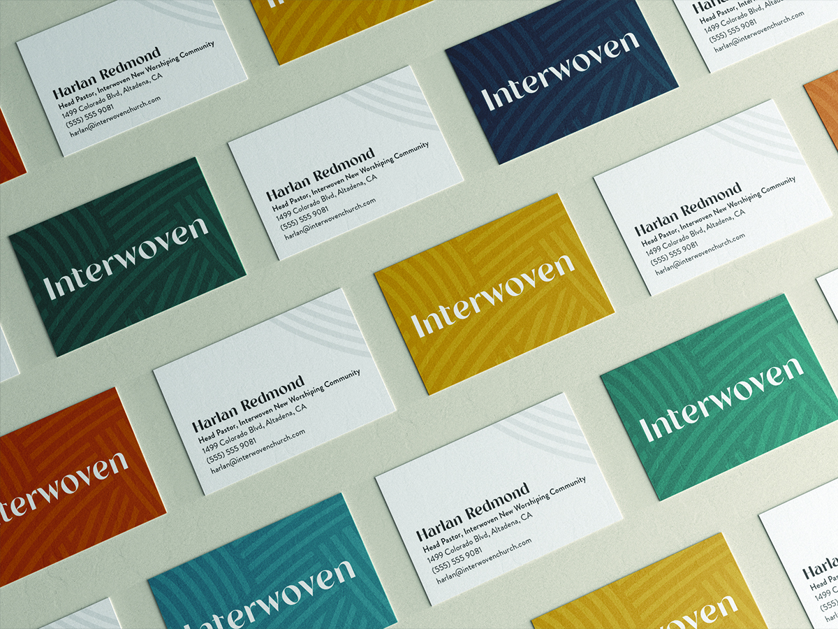
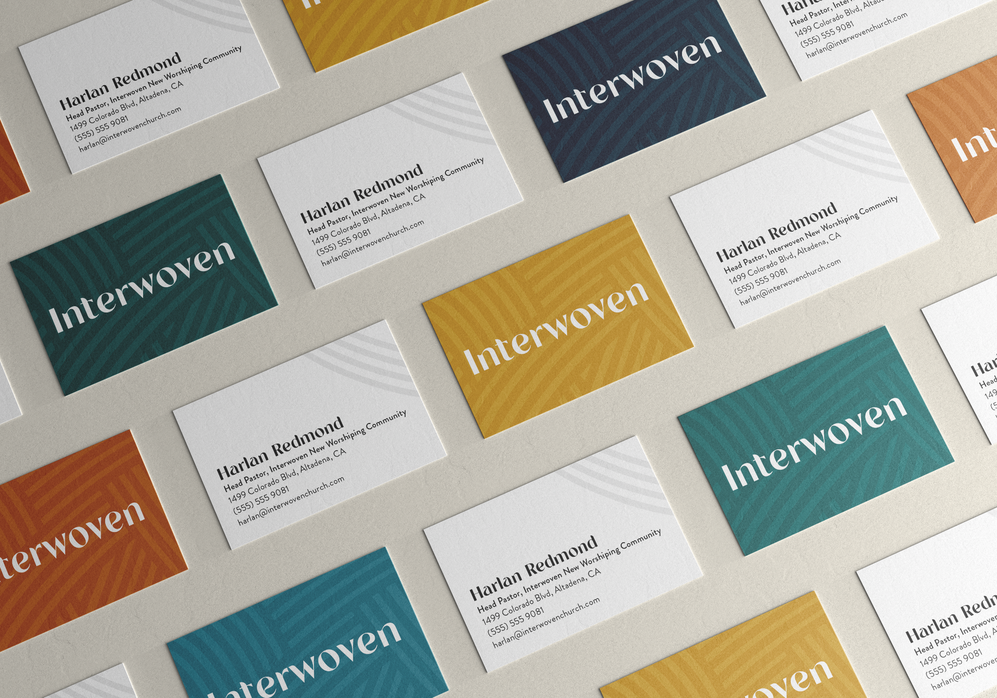
In practice, however, we found that these colors were too muted to give Interwoven the bold and vibrant feeling we wanted. I went back to the drawing board and came back a few weeks later with another take. After reflecting for a while on the thoughts behind the name ‘Interwoven,’ I decided to create not just a color palette, but bring in the same textures that were present in the logo to the way we used color elsewhere. I also gave each color duo a name that honored an element of the Altadena area.
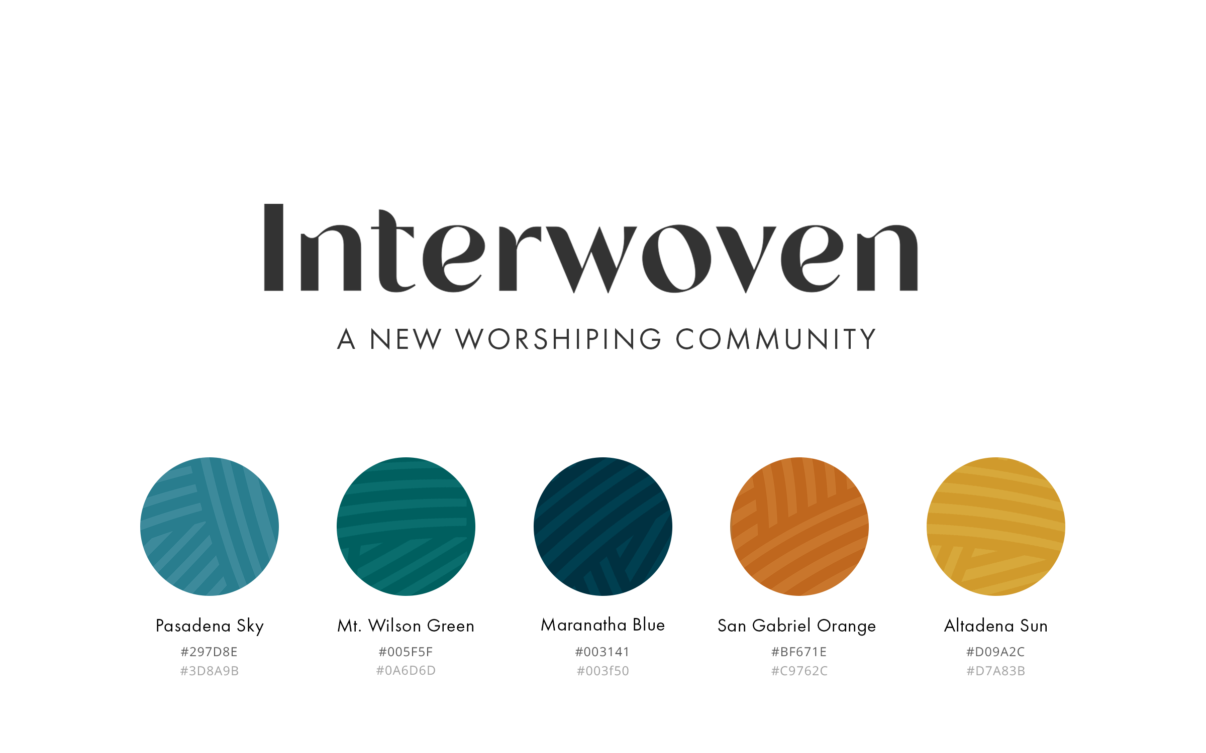
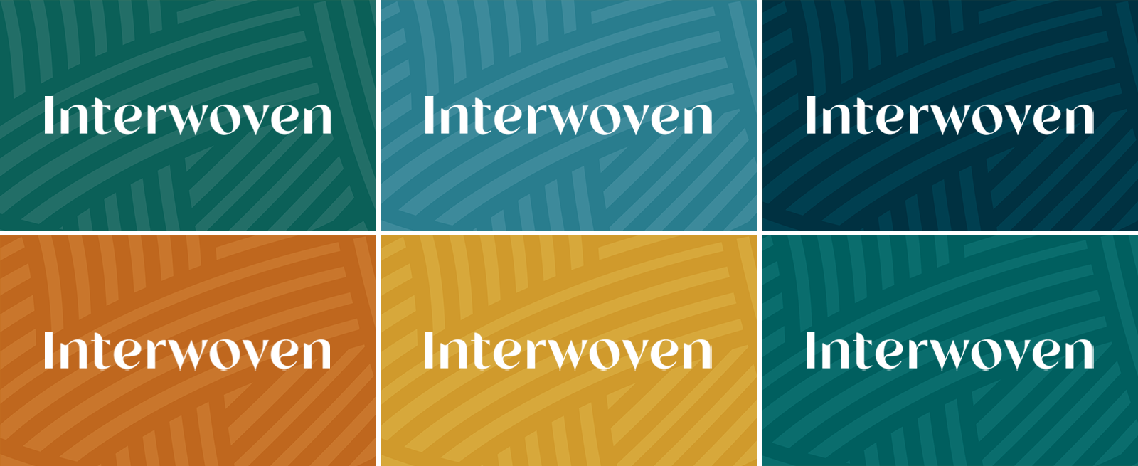
For the logomark, we incorporated these bold colors into the texture and shape the client first loved from our initial mockups.
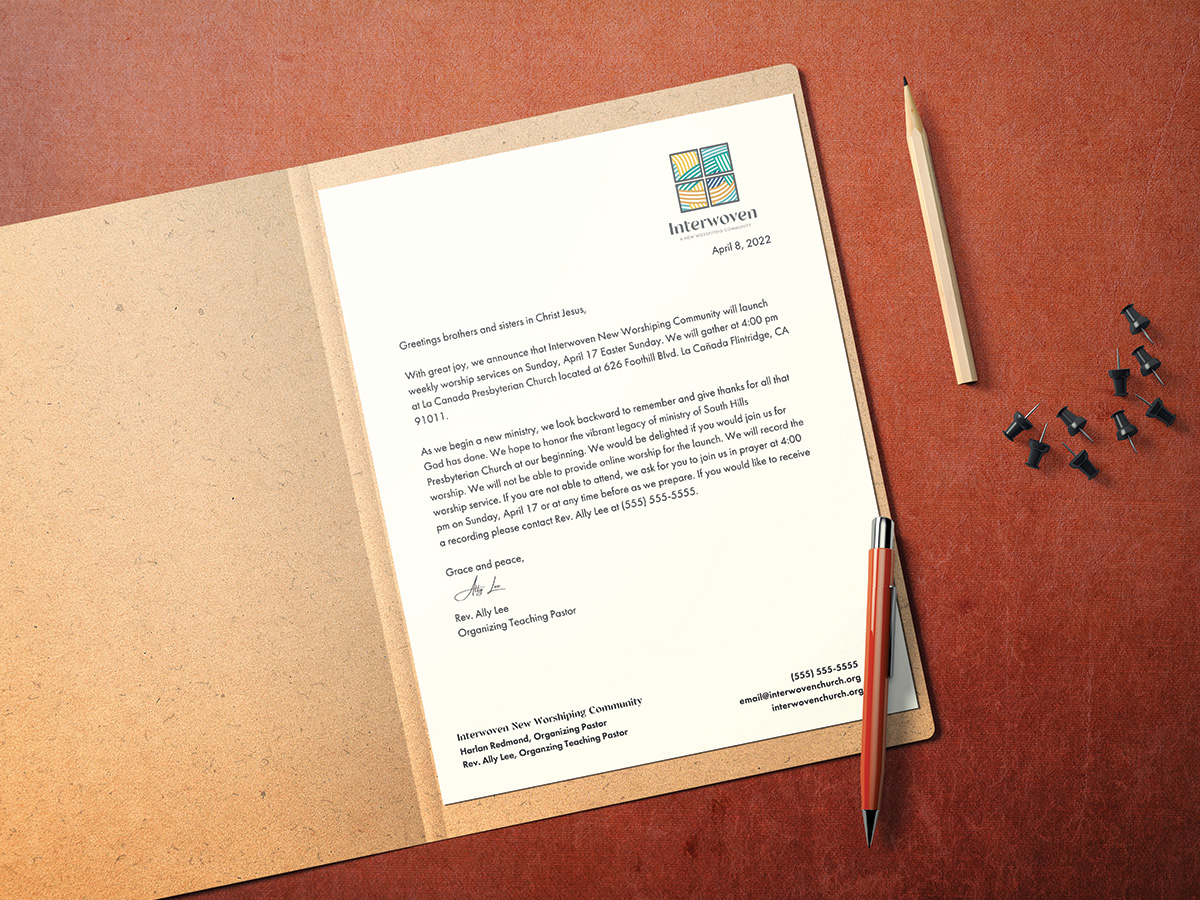
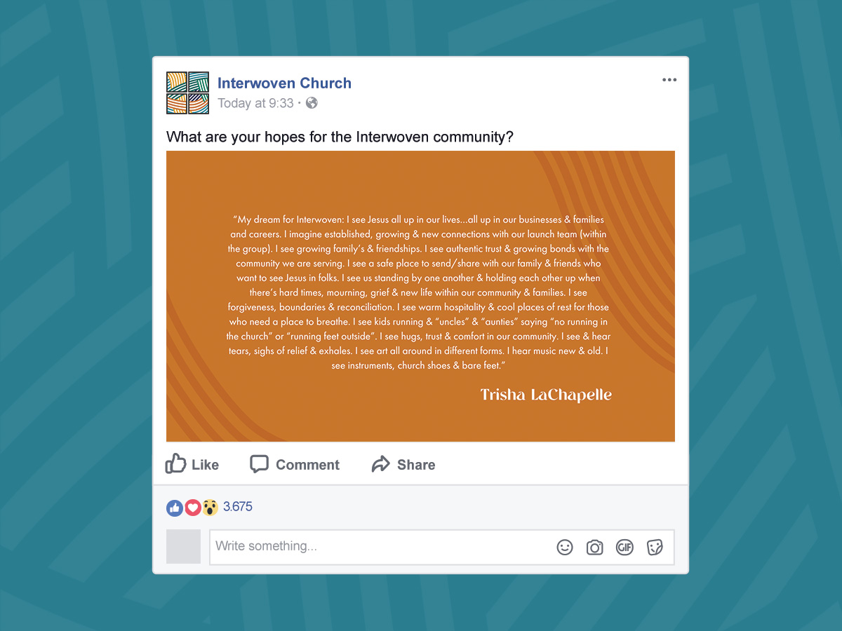
From here, I was able to design the other brand assets, including social media graphics, letterhead, and imagery for the site.