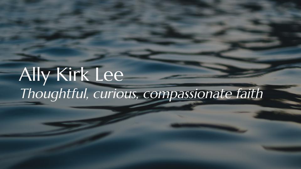
Ally Kirk Lee
Personal brand and website design
Brief
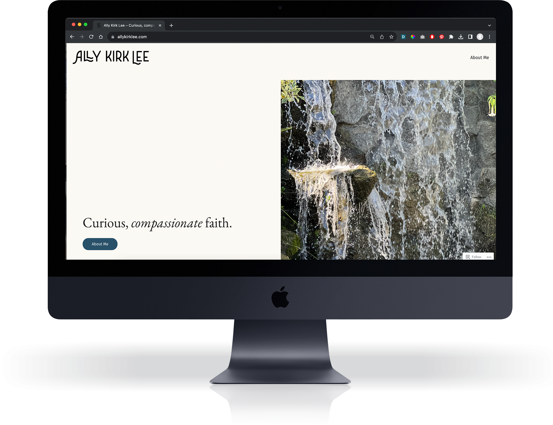
Ally contacted me to design her personal branding and build a custom WordPress installation as she started her job search. I had worked with Ally before on Interwoven, so I already had a sense for her personal presence, as well as a possible direction for her brand.
Discerning brand direction
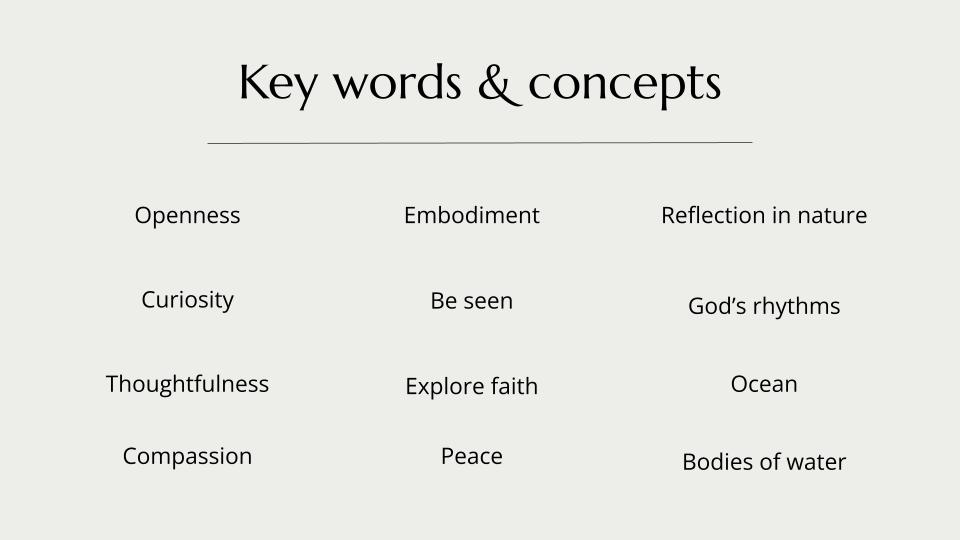
Over the course of several weeks, I met with Ally to get a better understanding of the identity she was trying to put forward as a minister. It quickly became clear that themes of compassionate listening, creative ministry, and a connection to nature came to the forefront. I drafted a presentation sharing the keywords I noticed when she talked about her ministry to make sure my understanding aligned with hers.
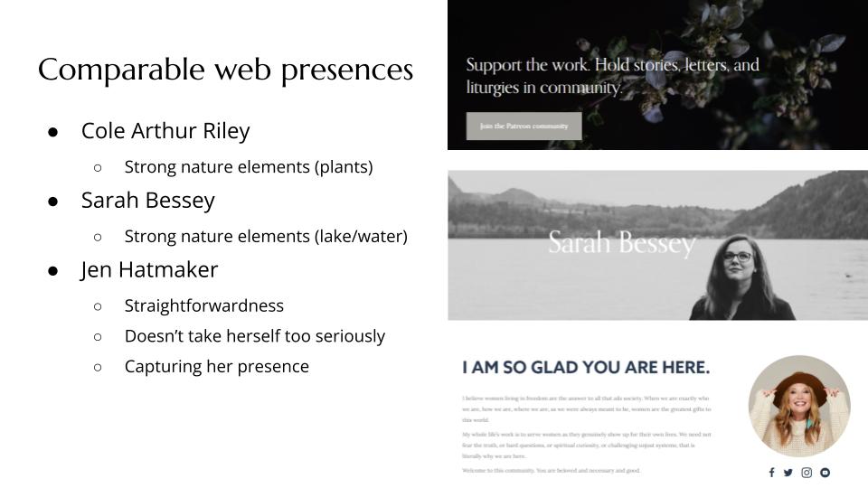
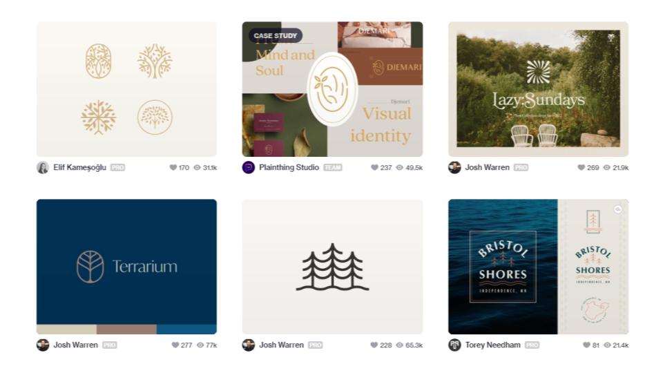
Once I knew we were on the same page, I gathered a few websites of comparable ministry professionals to see which elements she was and wasn’t drawn to.
Brand typography
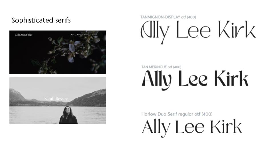
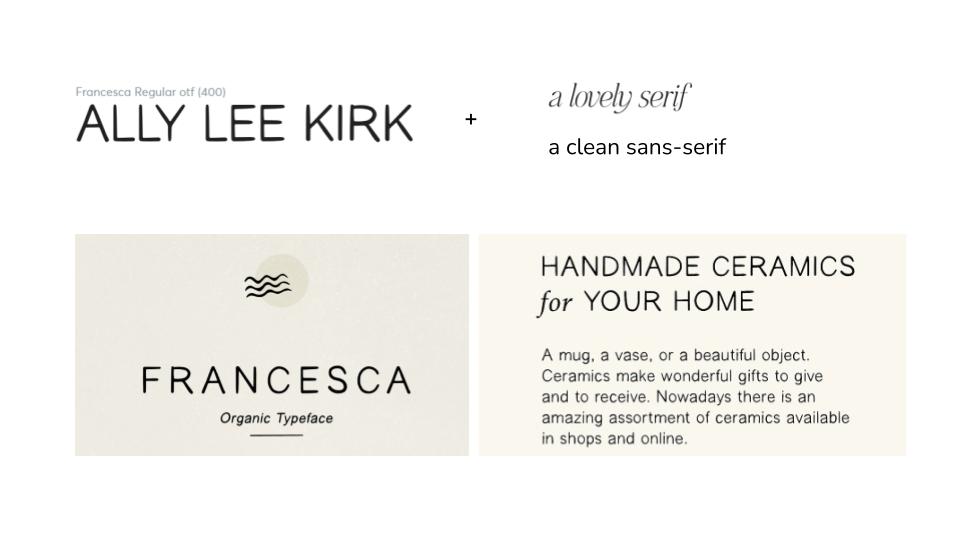
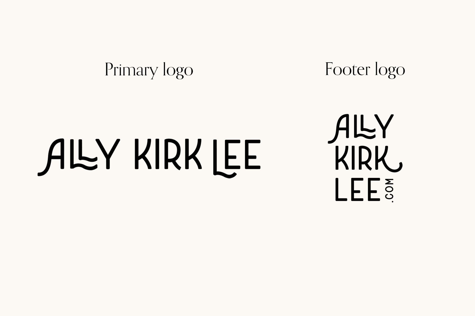
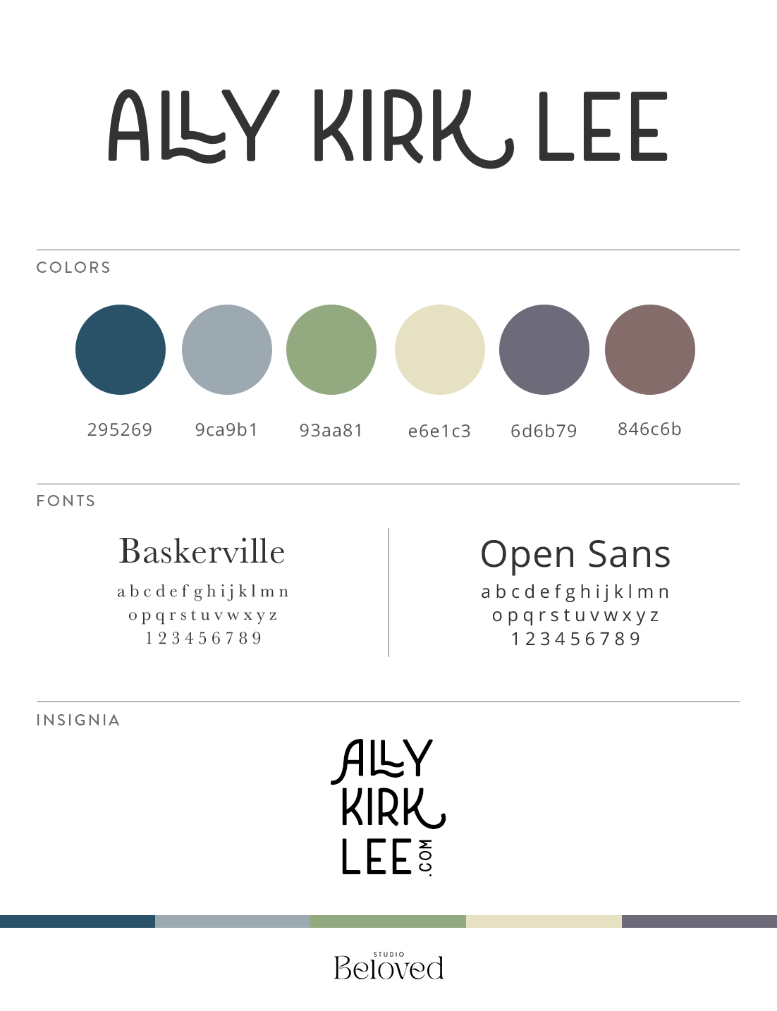
Based on her reaction to these, I started to gather font options for her personal logo. Since the logo was for her as a professional, I knew I wanted to stray away from using a logomark, and instead rely on typography that communicated the heart of Ally’s presence.
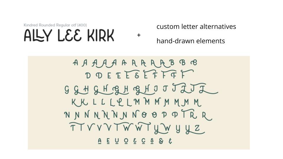
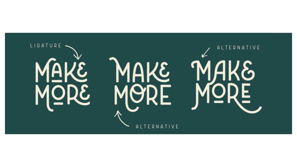
Ally was most drawn to fonts that felt handmade and allowed for unique expression. I found a beautiful font that had a quirky, hand-written feeling, but also included ligatures that mirrored patterns in nature. We ultimately decided to use this font as a foundation and customize the ligatures for her unique logo.
I customized the font for Ally’s logo, giving it a personal-handmade feeling, and opting for waves in the L ligatures that echoed the visual themes of water and nature found in other parts of the website.
Color palette
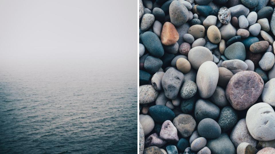
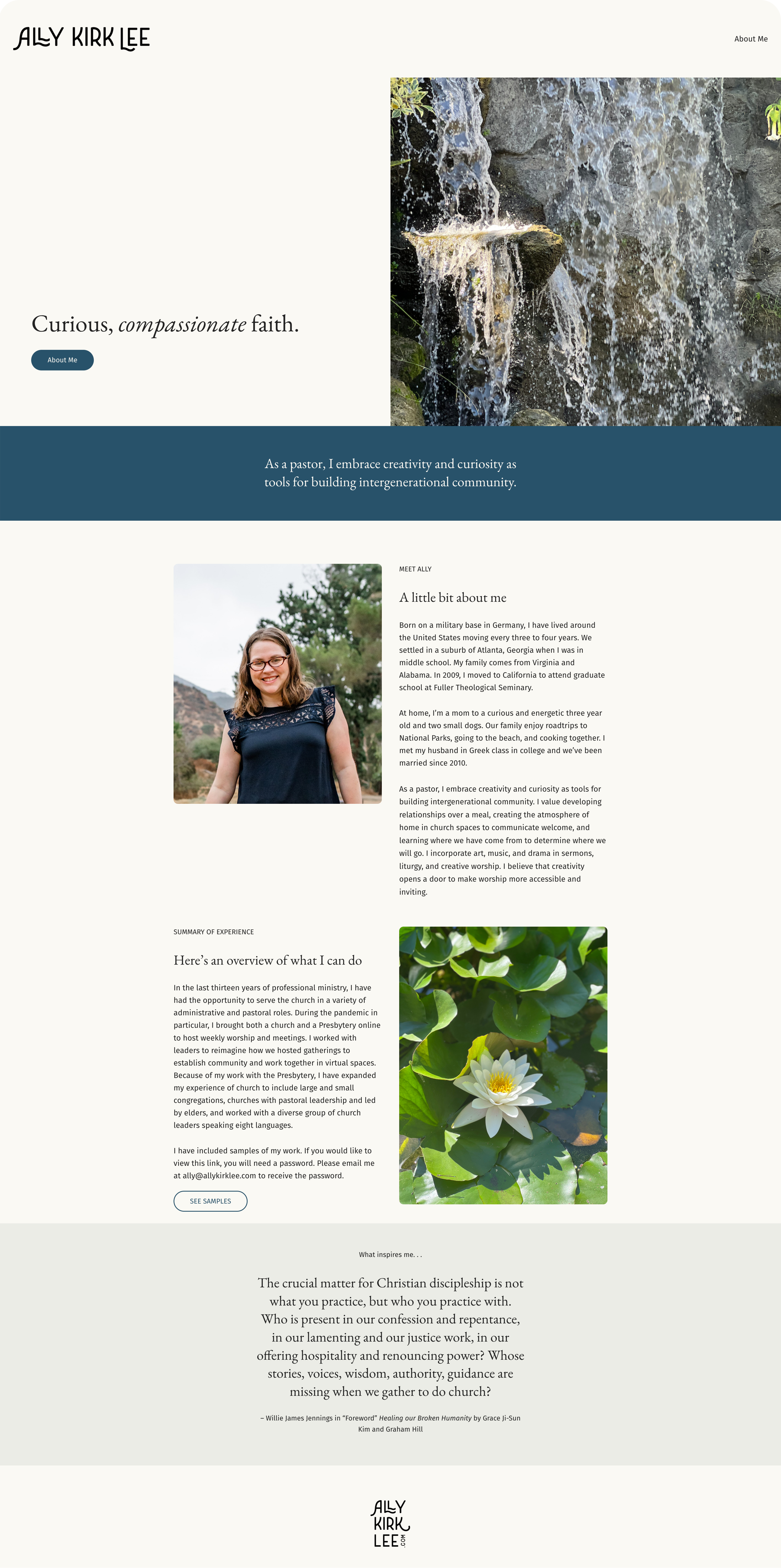
Next, I shared some visual inspiration for her website, as well as photography that reflected her love for nature and the role that played in her ministry.
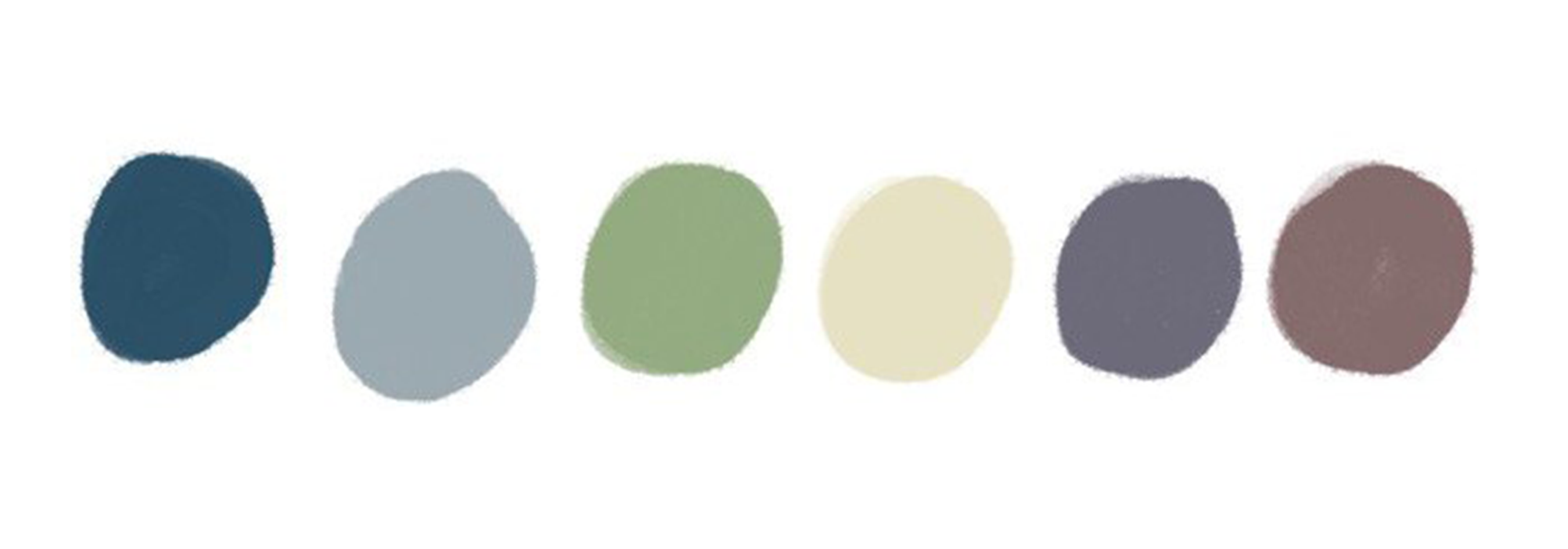
On the basis of Ally's feedback, we settled on a color palette inspired by the nature of her surrounding area.

